Calligraphr + FontForge: Layman's Overcomplicated Guide to Making a Good-Looking Font for Free
May 3, 2025
Contents
In December 2024, I designed a typeface based on my handwriting using both Calligraphr and FontForge (here's what it looks like). Calligraphr is a great service that lets you create your own font, but it's really only useful if you upgrade to the Pro version. So instead of spending $4 a month, you can do what I did as an amateur at typeface design, and spend a little more time in FontForge to make a good-looking font.
Here are links to the various websites/apps we'll use to create the font:
- Calligraphr (free website)
- FontForge (free app)
- Recommended but not necessary: image editing software like Photopea (free website), Adobe Photoshop (paid app), or Adobe Illustrator (paid app).
- Also recommended if you're using image editing software but not necessary: A drawing tablet (especially if you're making a handwriting-based font)
There are many other ways you can create your font. Some other websites/apps that I didn't use, but also seem to be good, include FontLab (paid app), Birdfont (paid app), Fontself (paid Adobe extension), and FontStruct (free website).
Beginning with Calligraphr
Start by creating an account and creating a template (in the Templates section) with the glyphs that you want to be included in the font. In the free version of Calligraphr, only 75 characters can be added to a single font, but you don't have to worry about this until later. Ignore the warning message to upgrade to the Pro version, and add as many characters as you like.
If you just want to include the most common English characters in your font, I recommend simply clicking "Minimal English," "Minimal Numbers," and "Minimal Punctuation" on the left sidebar.
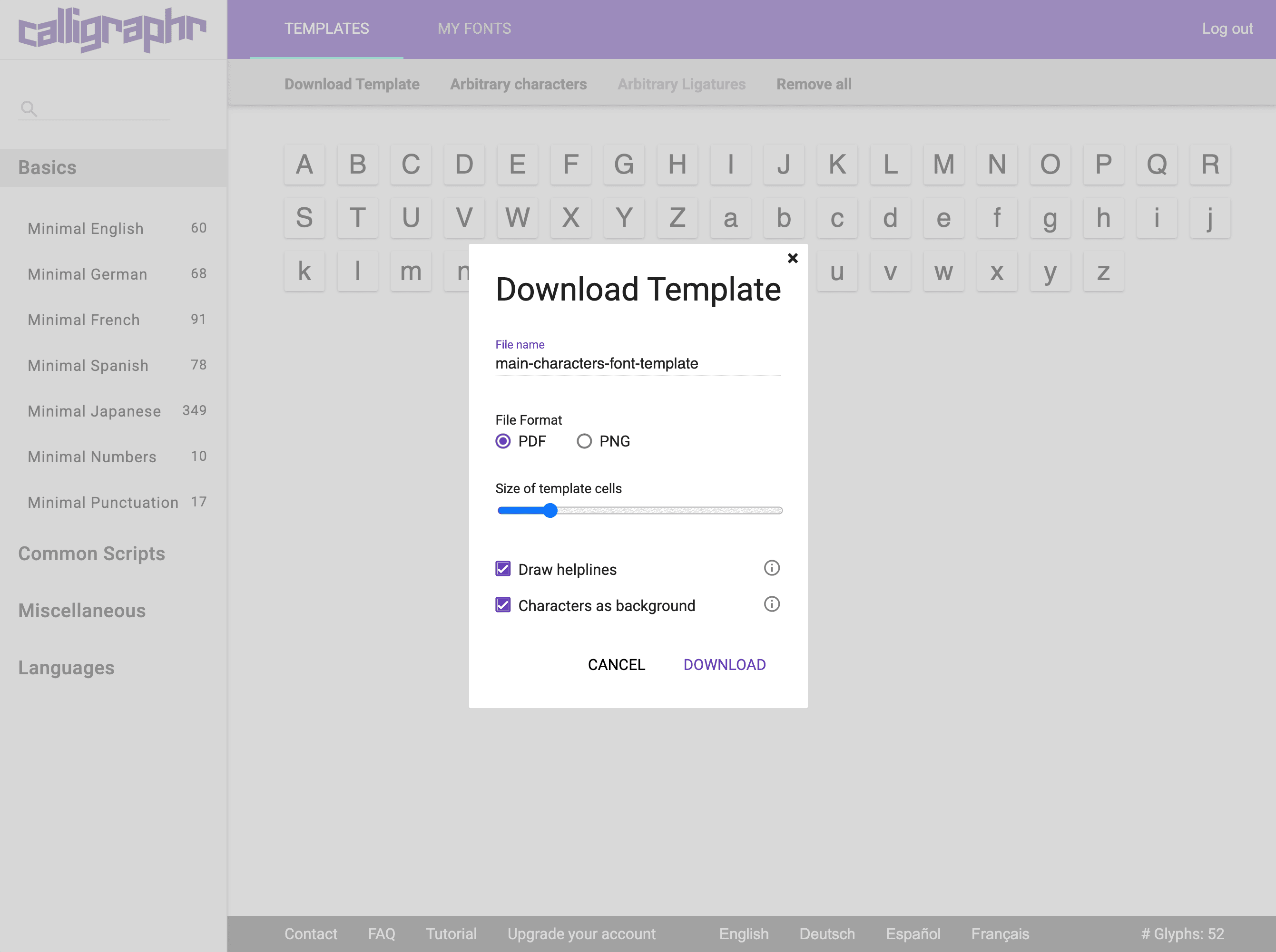
Click Download Template at the top of the page. I recommend enabling "Draw helplines" and "Characters as background" to help with drawing the characters. Setting the file format to PNG instead of PDF may also make it easier if you plan to use image editing software. Click Download to download the font template file(s).
Now you have some options:
- You can print out your templates and start filling them out by hand, which Calligraphr recommends.
- Alternatively, you can fill out the templates in some kind of image editing software, like I did. With my handwriting font, I found that drawing the characters on the computer using a drawing tablet makes the font turn out much cleaner.
Downloading from Calligraphr
After filling out the templates, you can now upload your templates to Calligraphr. Go to the My Fonts section > Upload Template > Choose File > Upload Template > Add Characters to Your Font.
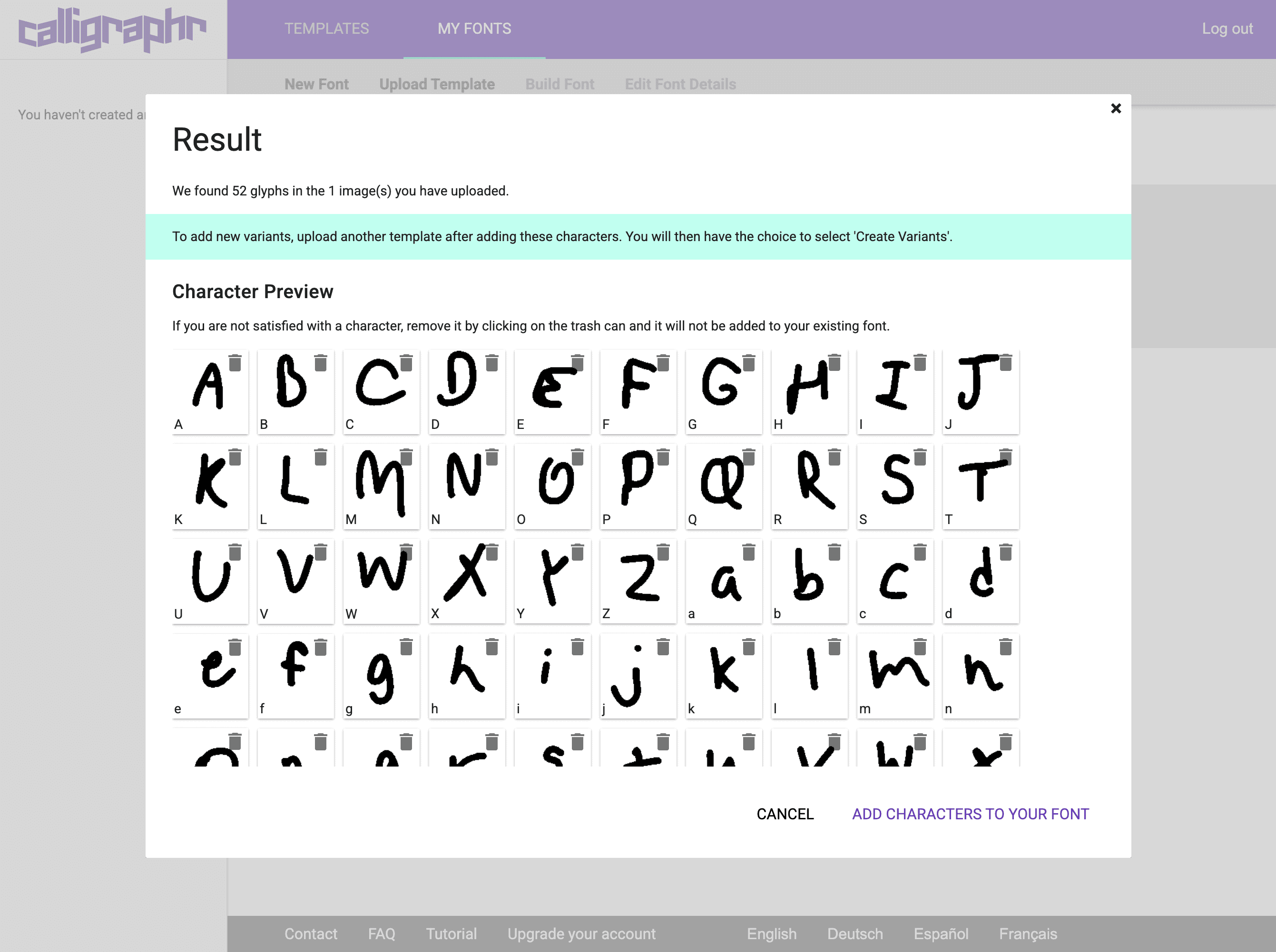
Here, there are some minor improvements you can make to your font, but I recommend waiting until you're in FontForge, where more precise adjustments can be made.
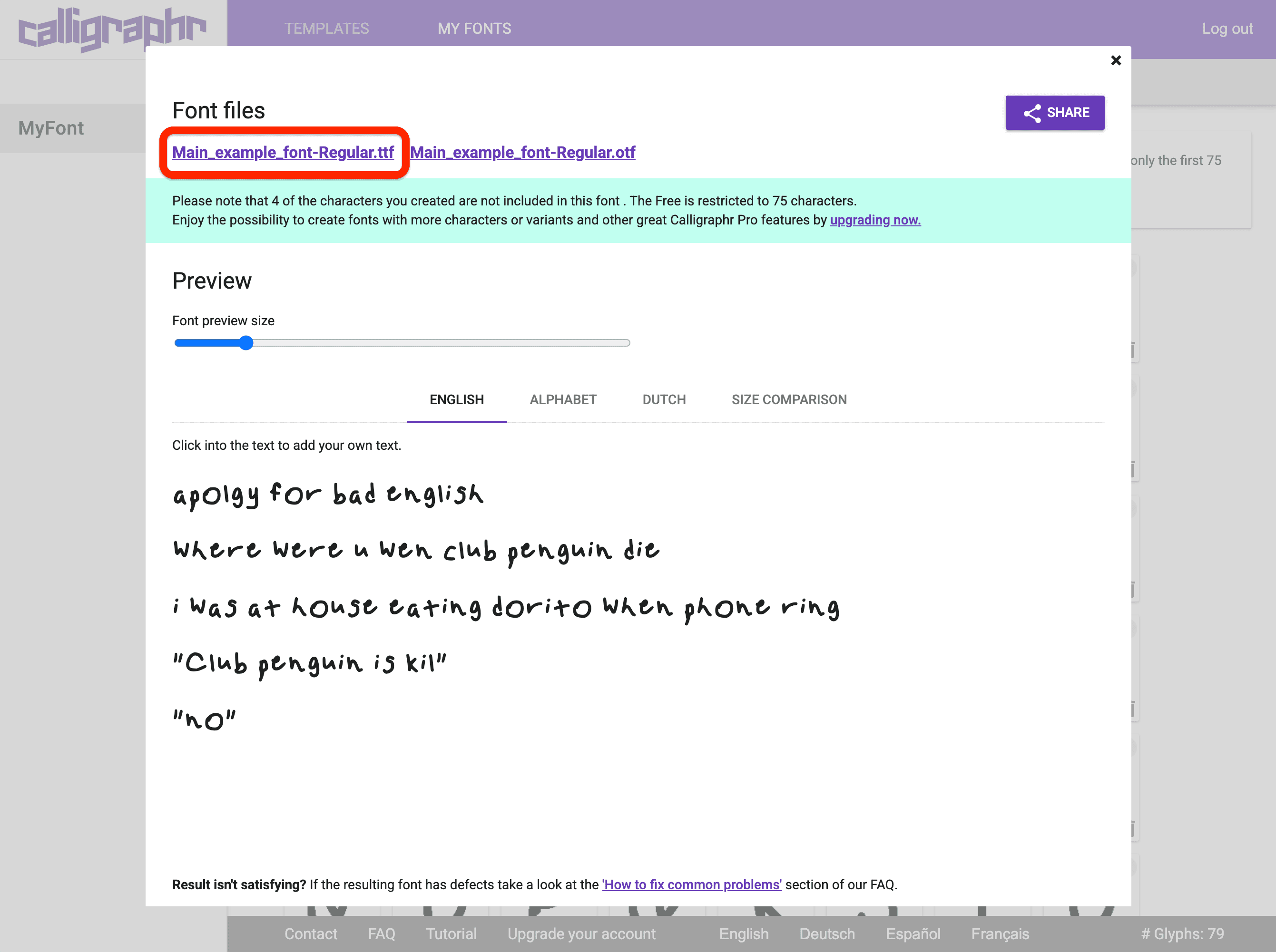
To download your font, click Build Font > Build > click the text in the top left that says the name of the font file. I recommend downloading as .ttf since that is what I used.
If you have more than 75 characters in your font, the free version of Calligraphr will only use 75 of them when downloading the font. To work around this, download the font as normal at first, delete each character in Calligraphr that was included in the downloaded font, then download the font again.
Do not just delete the first 75 characters. Calligraphr uses some other method to decide which characters are included in the font if you have more than 75. Just delete the ones that were included in the first font file.
If you have even more characters (more than 150), just repeat this step. You should now have one .ttf file for every 75 characters in your font, which we will later merge in FontForge.
Uploading to FontForge
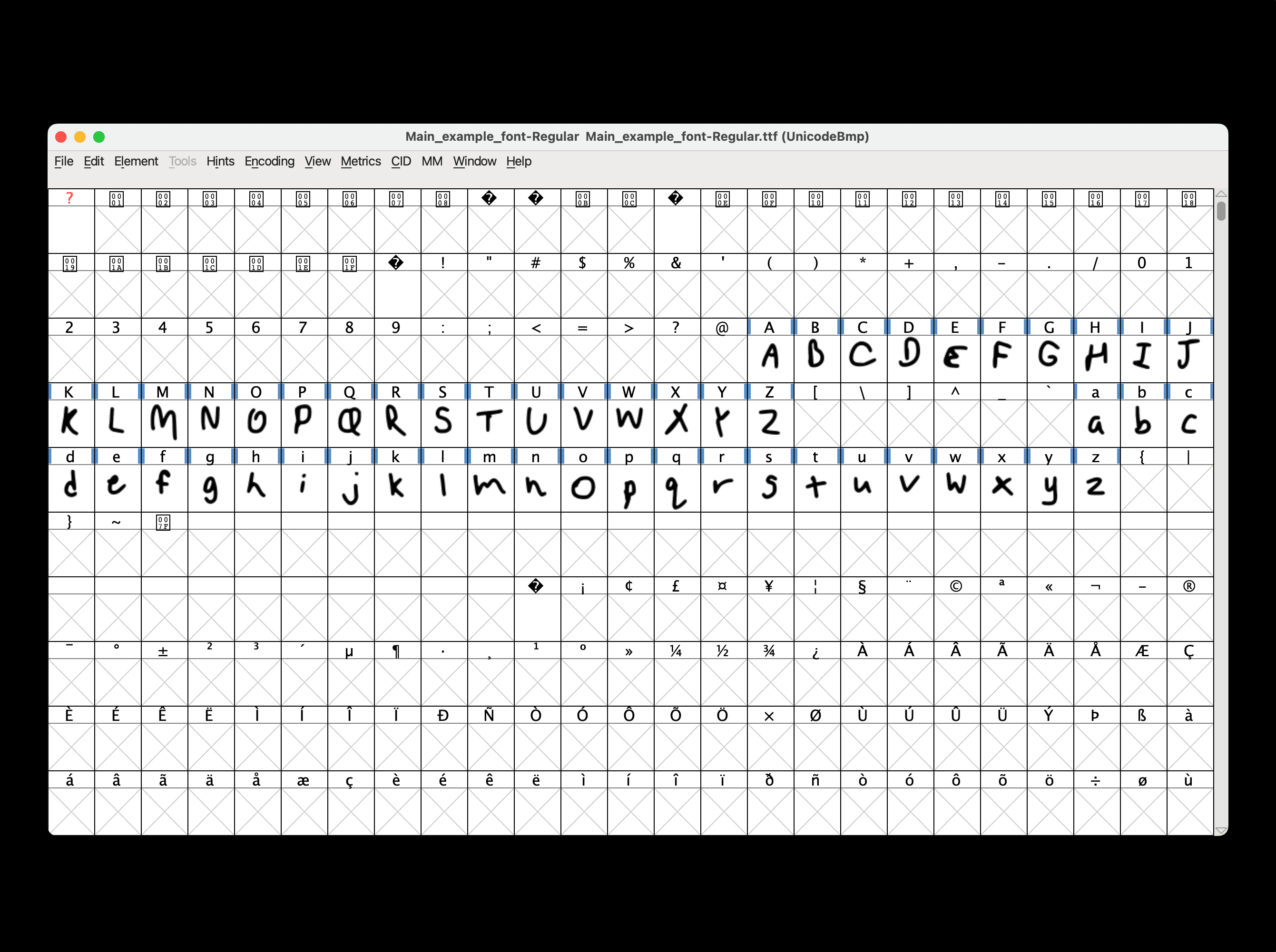
Before we can begin making adjustments to the font, we need to upload the first font file to FontForge. To do this, open the newly installed FontForge and use the file finder to select your font. Then, click OK to upload. FontForge should now have all of the glyphs of this font file displayed.
Merging Fonts
If you have more than one font file, it's important to merge them before changing anything. Once the first font is uploaded, click Element > Merge Fonts... > select the second font file > OK > Yes. (It doesn't actually matter right now if you choose Yes or No for this.)
If you have more than two font files, just repeat this step again.
Now, FontForge should have all of the glyphs from your font displayed.
Remember to save your font whenever changes are made! Click File > Save > Save (Mac: Command+S / Windows: Control+S). FontForge saves your work as a .sfd file. We'll export the font as a .ttf file later.
If you notice that your font is missing some important characters that you now want to include, you can always go back to Calligraphr, create a new template with those characters, and repeat the previous steps to merge them into your font. All the characters should be added before we start making adjustments.
Making Transformations
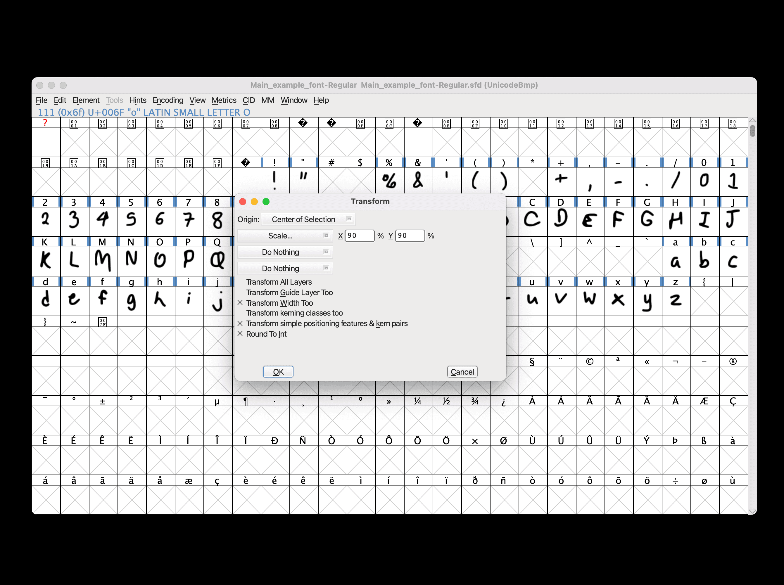
If one of your glyphs appears a little off, you can change its size, positioning, rotation, and more in FontForge. First, select the glyph you want to change by single-clicking it. Then, go to Element > Transformations > Transform...
Scaling
To change the size of a glyph, select "Scale..." in this Transform window and change the percentages for X and Y. To decrease or increase the size, make the percentages the same for both values, but if you want to squash or stretch, they can differ.
For this example in the image below, I reduced the size of this glyph to 90% of its original size. Make sure you have these same options enabled before transforming: "Transform Width Too," "Transform simple positioning features & kern pairs," and "Round To Int."
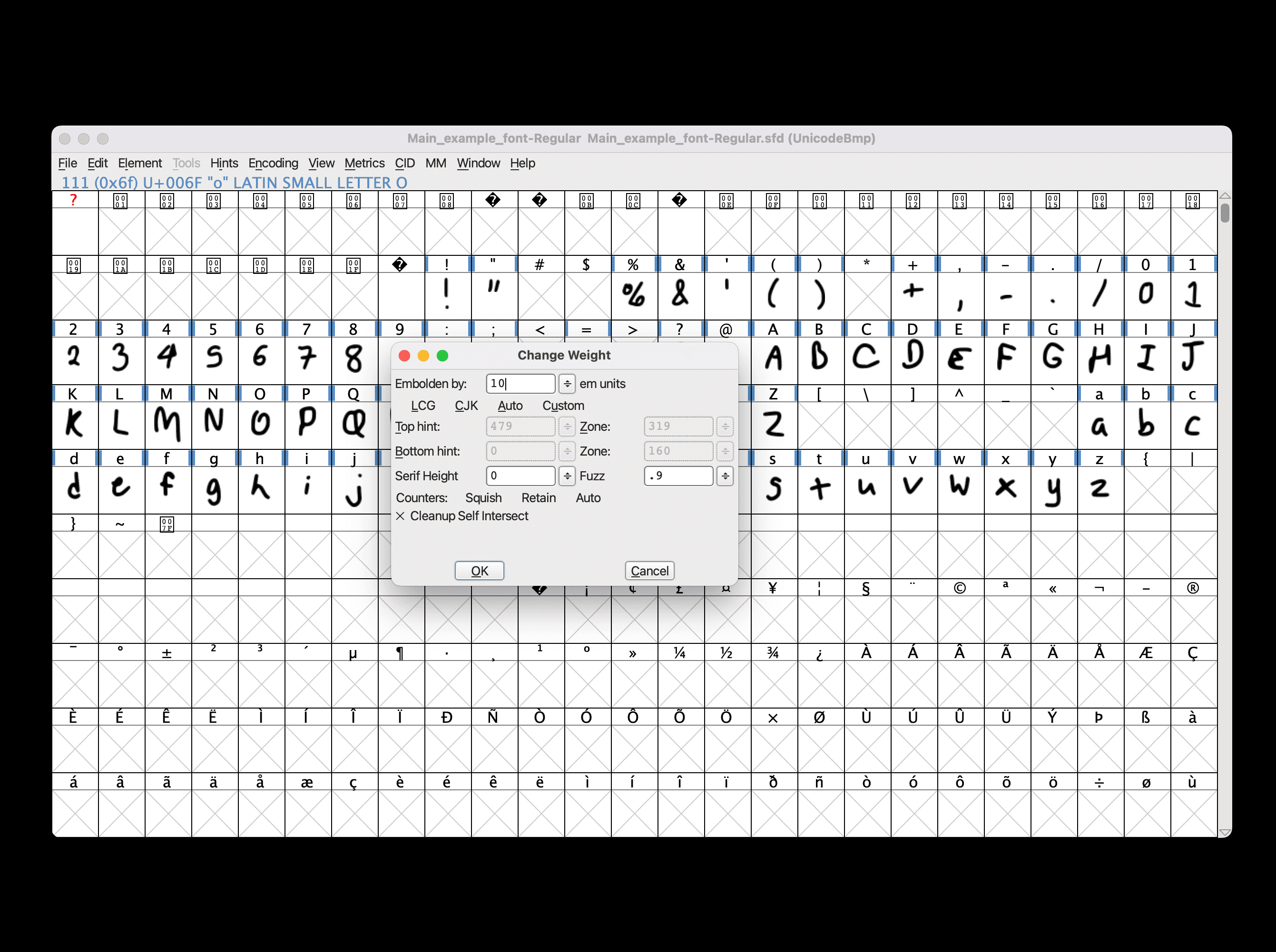
Decreasing or increasing the size of a glyph will likely make it look thinner or thicker than the rest of the glyphs. To fix this, you can change the weight of the glyph by going to Element > Style > Change Weight... > change the number next to "Embolden by" by a certain number.
If you need the glyph to be thinner, you can enter a negative number. If you make it too thick or too thin, you can always undo (Mac: Command+Z / Windows: Control+Z) and enter a different amount.
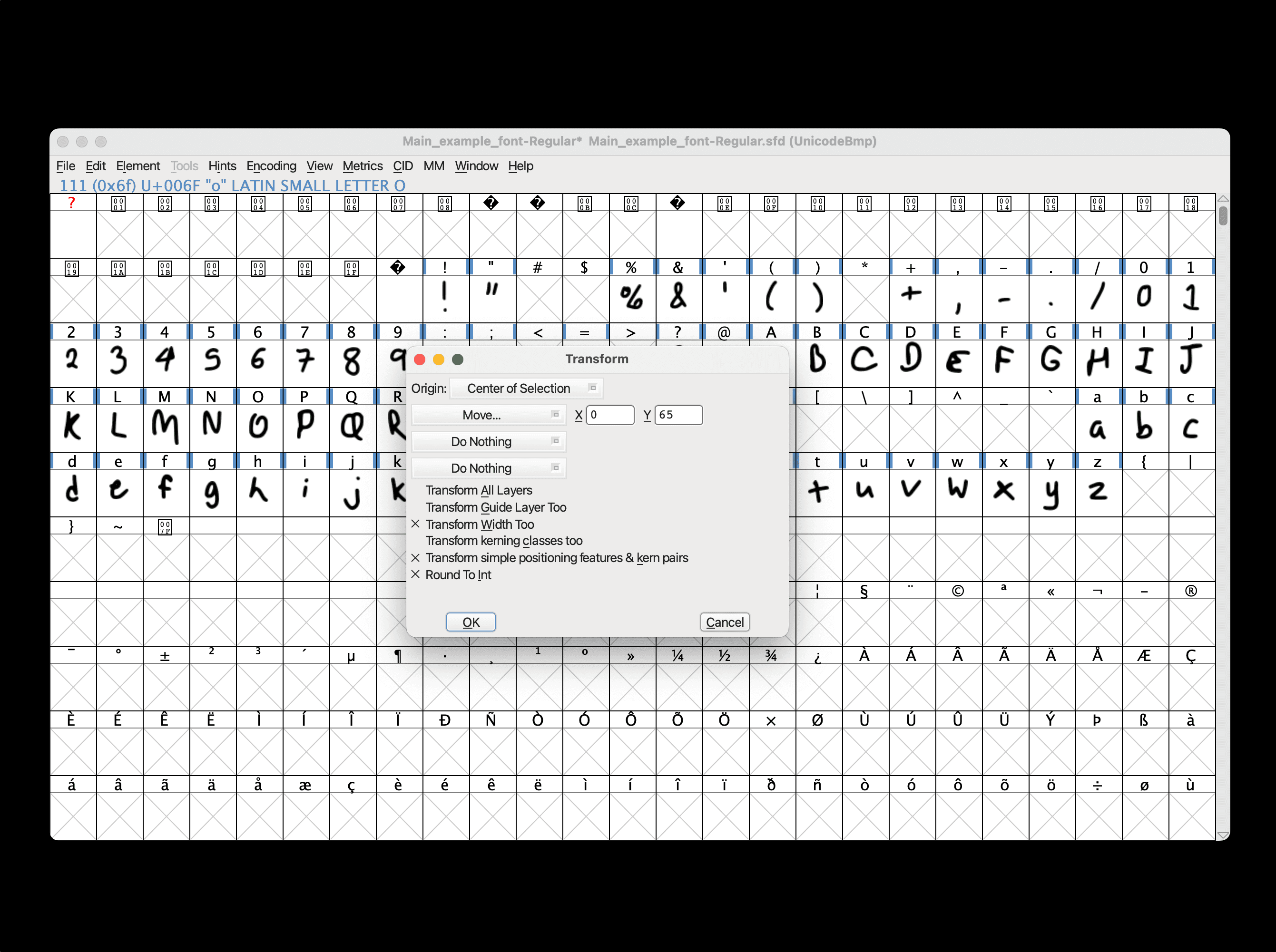
Vertical positioning
If one of your glyphs looks too low or too high compared to the others, you can change its vertical positioning. Select the glyph you want to change, then go to the Transform window again (Element > Transformations > Transform...).
Here, select "Move..." and enter how much you want to move the glyph, X for horizontally or Y for vertically. Entering a negative number will move the glyph left or down, while entering a positive number will move it right or up.
I recommend not changing the horizontal positioning, since it might mess up the kerning. Again, make sure you have these same options enabled before transforming: "Transform Width Too," "Transform simple positioning features & kern pairs," and "Round To Int."
Making Precise Adjustments
You may still have some glyphs that don't look quite right, even after scaling, moving, or rotating. Luckily, FontForge allows us to make even more precise adjustments.
Making these adjustments can be tedious, but it can really improve the quality of your font.
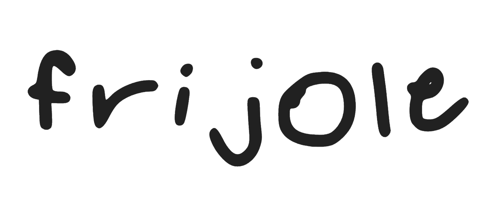
Before adjustments
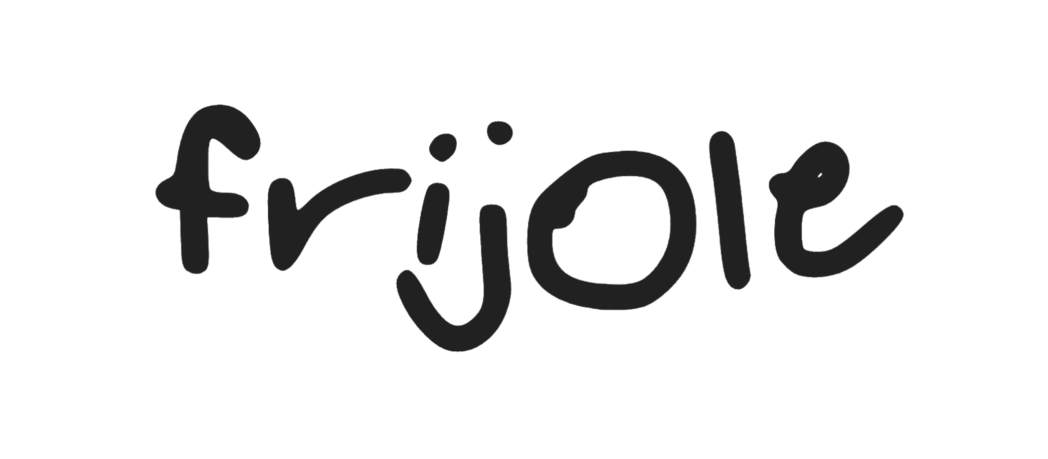
After adjustments
Double-click a glyph to enter a more advanced editor window. Here, you can adjust the position of each point that makes up the glyph.
You can move around the different symbols to change the appearance of the glyph. Feel free to experiment with moving around the different points. You can always undo your changes (Mac: Command+Z / Windows: Control+Z) and exit the editor.
To move around a larger part, select a group of points by clicking and dragging a box around them, then click and drag one of the selected points.
It's important to try to keep your original handwriting style in each glyph and not correct each glyph too much. The final font should still look like something you would naturally write.
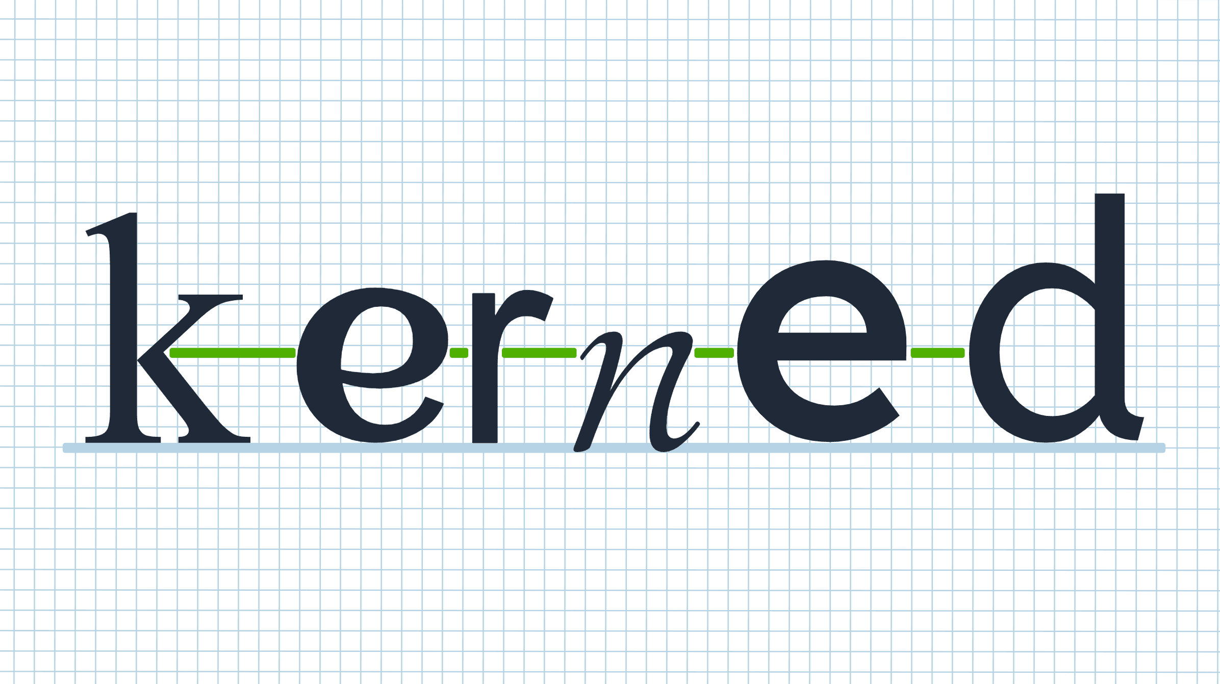
Kerning
Kerning is the spacing between different characters in a font. The amount of space between any two characters can vary, depending on how each one looks. With kerning, the font flows better, and it looks more natural, especially with handwriting fonts.
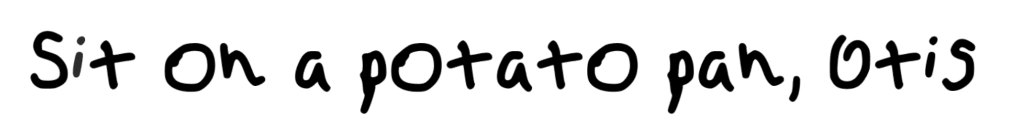
Handwriting font without kerning
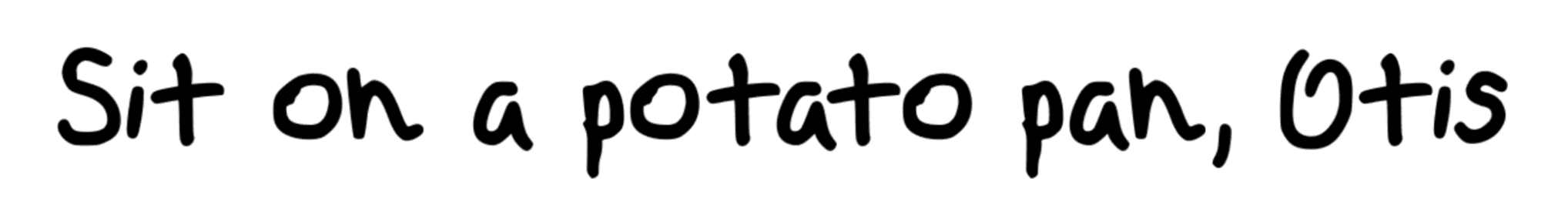
Handwriting font with kerning
Autokerning
FontForge has a useful tool that can automatically kern your font. I followed this YouTube video to autokern my own font, and I'll use the steps there to explain how to do it here.
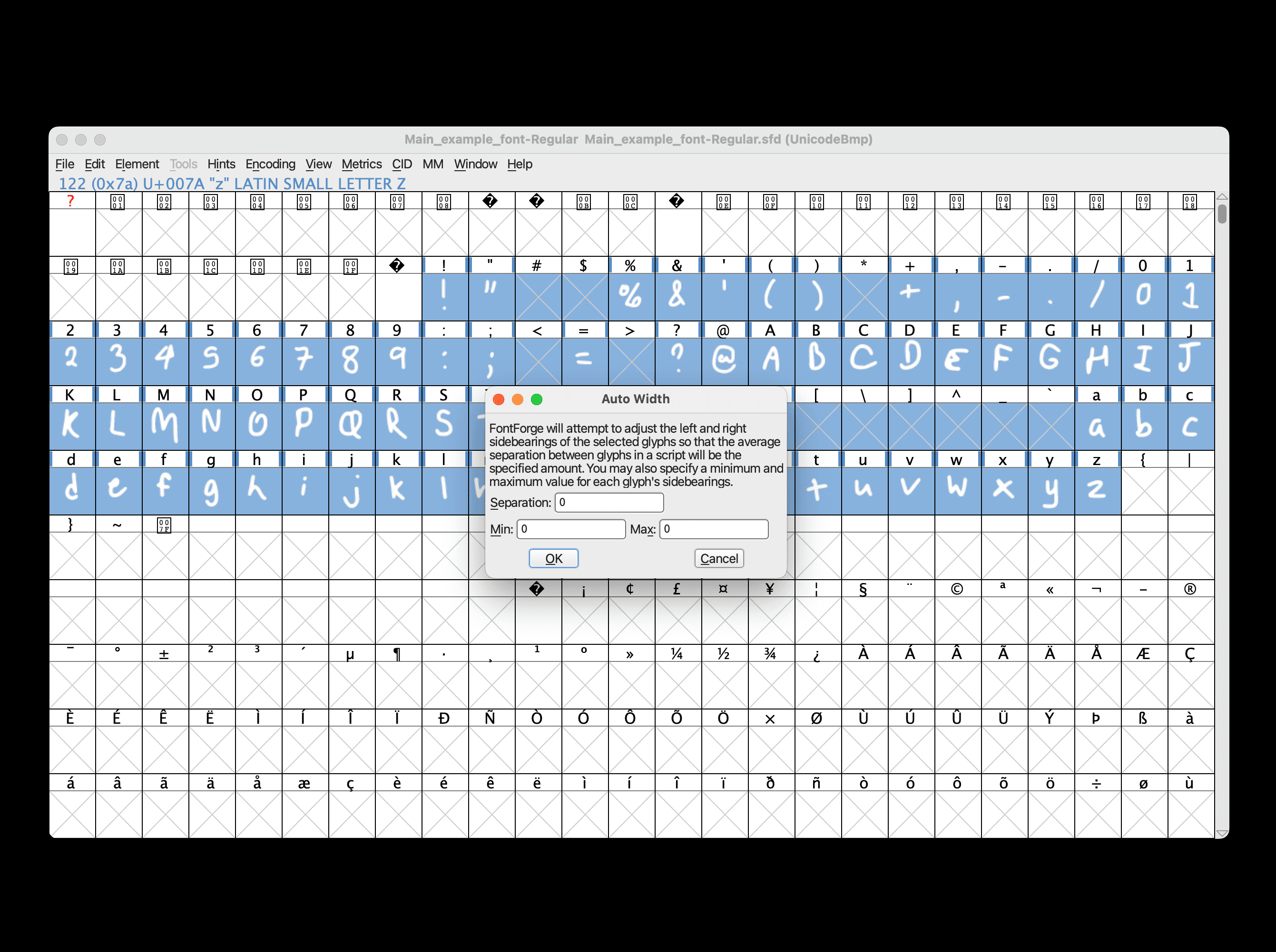
Select all characters (Mac: Command+A / Windows: Control+A) > Metrics > Auto Width... > set the separation, min, and max all to zero > OK.
Next, go to Element > Font Info... > Lookups > GPOS > Add Lookup.
Then, next to "Type", click the dropdown, and click "Pair Position (kerning)."
In the space under where it says "Feature," click the down arrow next to <New> > "kern horizontal kerning" > OK.
Now this lookup has been added.
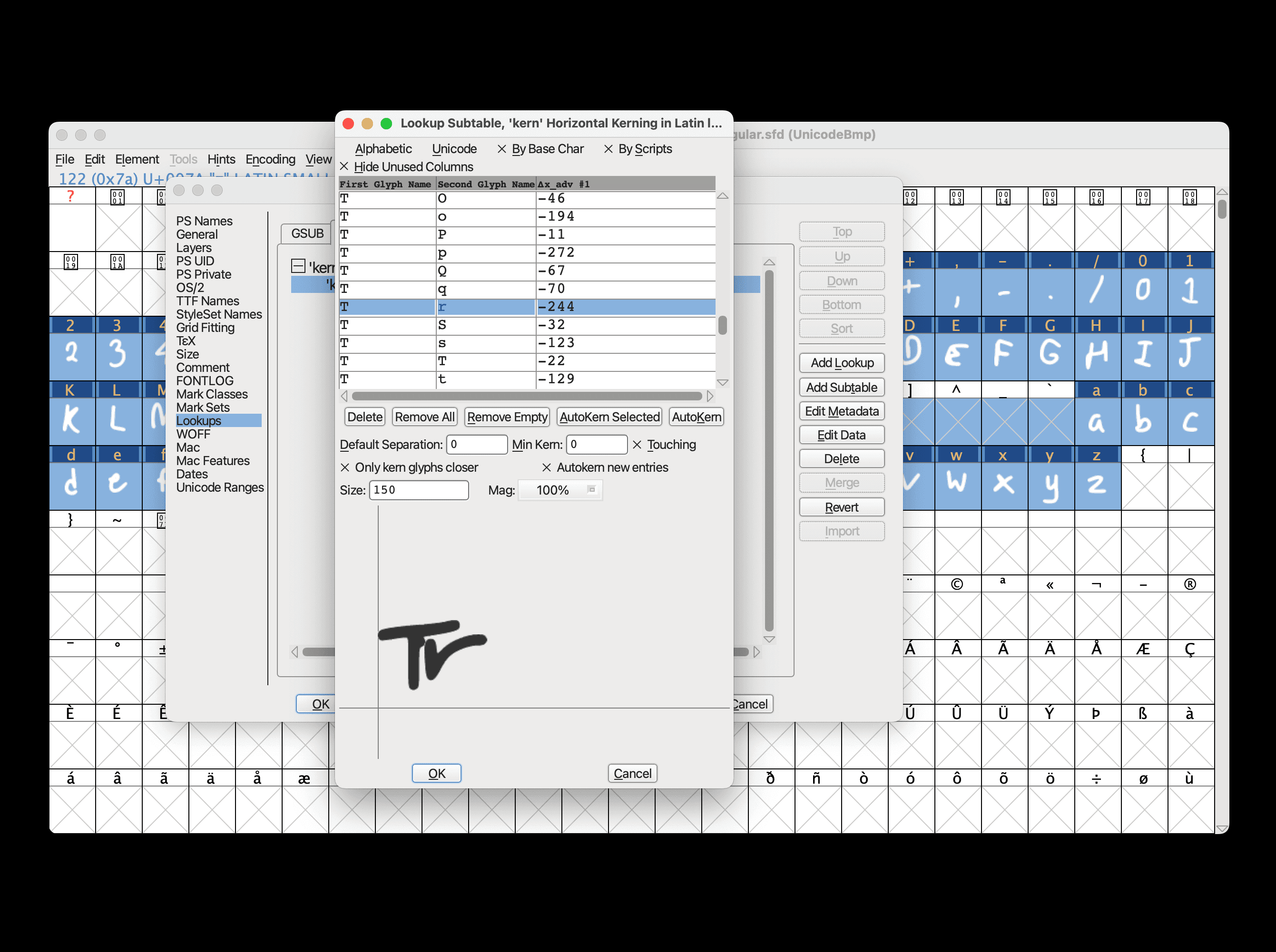
Select this newly added lookup if it has not already been selected, then click Add Subtable > OK.
In this window, you can set Default Separation and Min Kern both to zero. If you are okay with the characters being so close that they are touching, select Touching. I recommend these settings, especially for handwriting-based fonts.
In the character selection area below, I recommend deselecting every character and then only selecting the lowercase and uppercase letters in both the top section and the bottom section. Kerning is unnecessary for other characters like numbers or symbols. Once you're finished here, click OK.
In this new window, you can view the different kerning pairs for every combination of two characters. You can select a pair and see how close those two characters will be.
Right now, all of your characters in these kerning pairs will likely be so close that they're touching. Don't worry about this for now, since we'll increase the space between all of the characters later.
When you're done, click OK to save and close the subtable window, then click OK again to save and close the Font Info window.
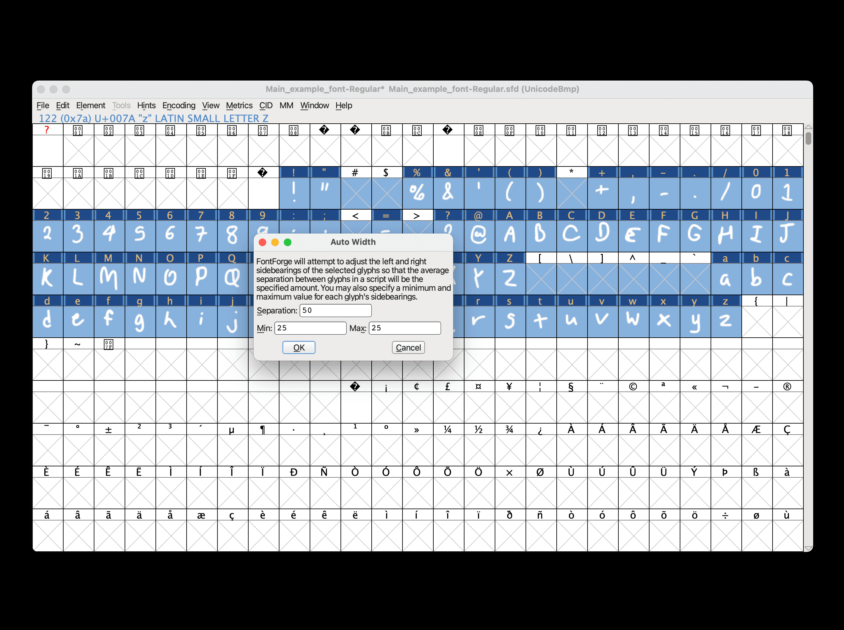
Now to increase the space between the characters, select all characters (Mac: Command+A / Windows: Control+A) > Metrics > Auto Width... > set the separation to 50, set min to 25, and set max to 25 > OK.
Previewing in FontForge
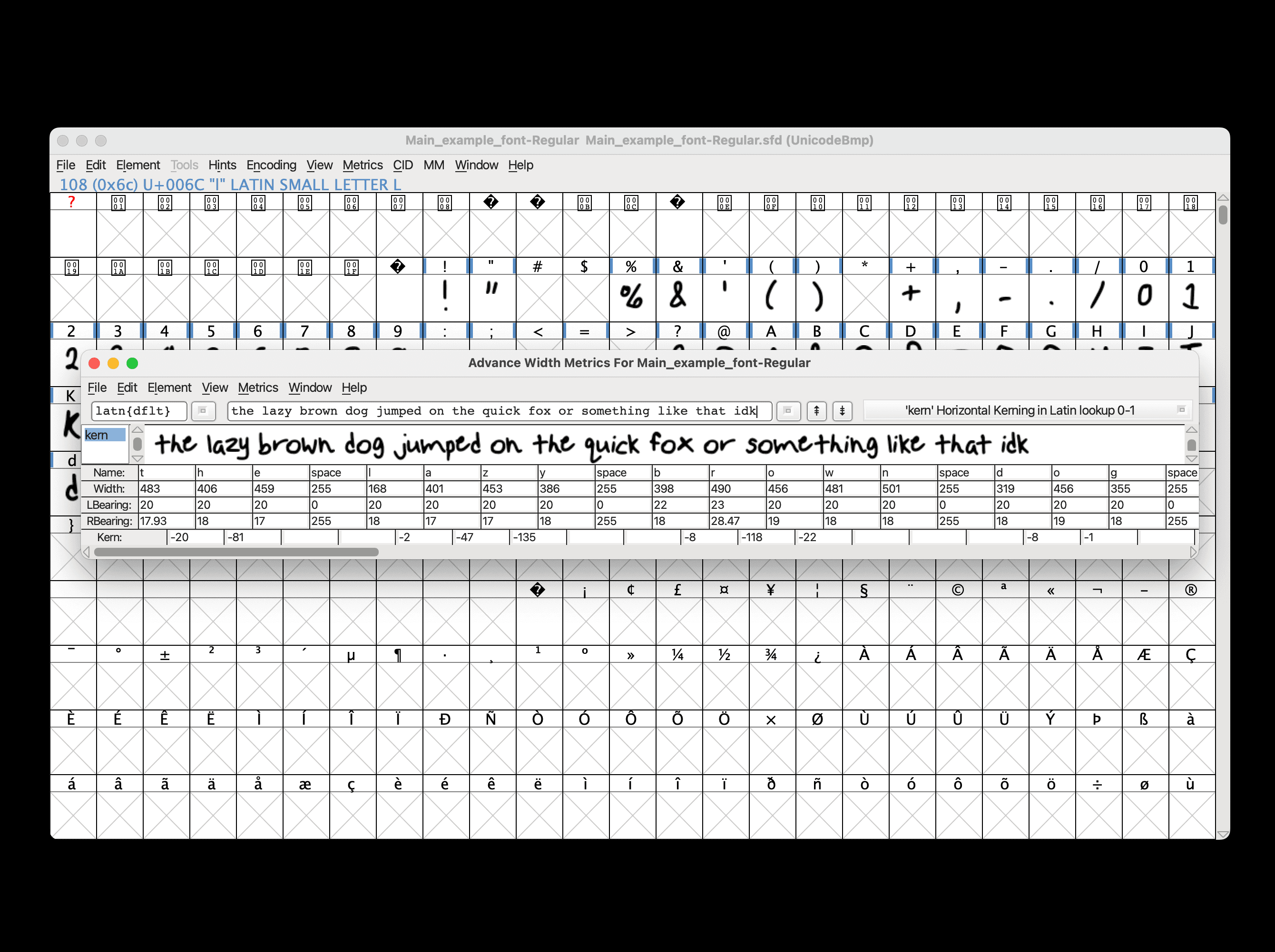
Before you download your font, you can preview it to make sure it all looks good by going to Window > New Metrics Window. If you think something doesn't look right, you can always go back to a previous step and adjust anything.
If you adjust something that changes the horizontal positioning of a glyph, you may need to go back and re-kern the characters.
Fixing Errors
There are a few common errors that FontForge will throw when trying to download a font. To ensure the best appearance and compatibility on all devices, you'll have to fix these errors.
...but if you don't care, you can just force FontForge to download the font.
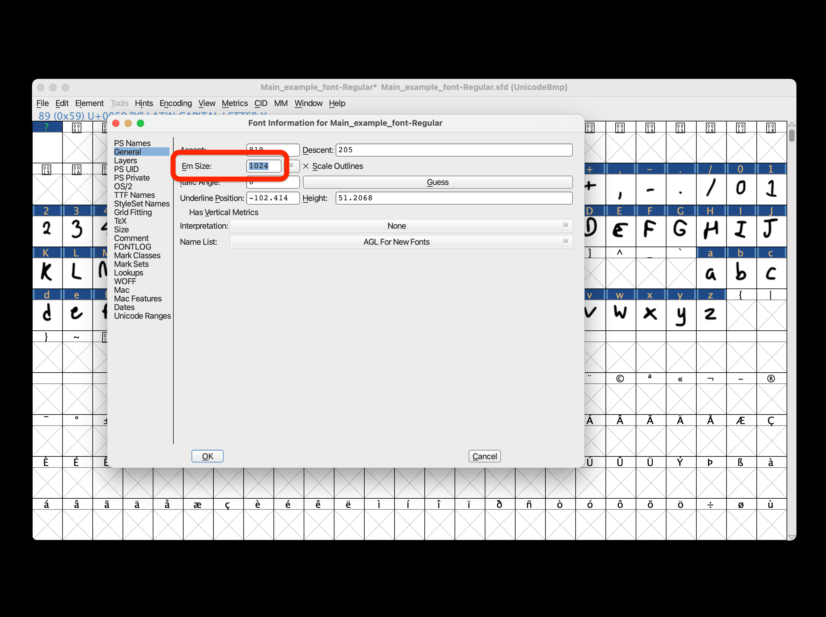
Fixing Em Size (for TrueType)
First, you'll need to fix your font's "em size." For TrueType font files (.ttf), the "em size" needs to be a power of 2. Go to Element > Font Info... > General > change the number next to "Em Size" to 1024.
Now try generating your font by going to File > Generate Fonts... > Generate. If you don't get any errors, congratulations! Your new font is ready to be used.
But most likely you have several errors that need to be fixed. Click Review on this window to see which glyphs need fixing. After fixing an error for a glyph, a different error may appear for that same glyph, so make sure you fix all the errors before generating the font.
Fixing "Missing Points at Extrema"
To fix the "missing points at extrema" error, we need to add extrema to the glyph.
Enter the glyph editor view (by double-clicking the glyph) > select all the points of the glyph (Mac: Command+A / Windows: Control+A) > Element > Add Extrema.
Fixing "Wrong Direction"
To fix the "wrong direction" error, we need to fix the direction of the path of the glyph.
Enter the glyph editor view (by double-clicking the glyph) > select all the points of the glyph (Mac: Command+A / Windows: Control+A) > Element > Correct Direction.
Fixing "Self Intersecting"
To fix the "self intersecting" error, we need to remove places where the glyph intersects with itself.
Enter the glyph editor view (by double-clicking the glyph) > select all the points of the glyph (Mac: Command+A / Windows: Control+A) > Overlap > Remove Overlap.
Sometimes, simply clicking Remove Overlap does not fix the error, so we need to find the self-intersection ourselves. You can use the zoom-in tool on the left sidebar to find where the glyph goes into itself. Then, move around whichever points are causing it to self-intersect.
Fixing "Non-Integral Coordinates"
To fix the "non-integral coordinates" error, we need to move the position of points that are not at integer values.
Enter the glyph editor view (by double-clicking the glyph) > select all the points of the glyph (Mac: Command+A / Windows: Control+A) > Round > To Int.
Generating the Final Font
Once all the errors are fixed (or you just stopped caring enough to fix them), you're ready to download your font! Go to File > Generate Fonts... > Generate.
Now What?
Now go use your font!!!!!!!!!